
Sunday, October 31, 2004
Friday, October 1, 2004


Wednesday, September 15, 2004
Chicago Owls
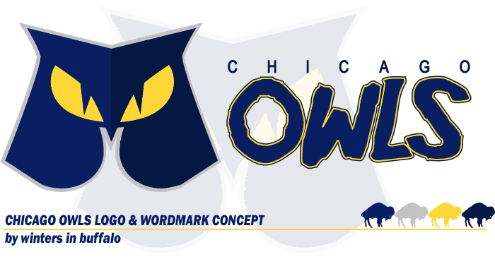
This is one of my favorites. Another contest winner. We were supposed to take an old Continental Football League (1965-69) team and modernize their identity. I chose the Chicago Owls.
Here's how it would look on the helmets...

And here are the uniforms...

For reference, here's the original...

Wednesday, September 1, 2004
Buffalo Steamrollers
Presenting... my fantasy football team, the Buffalo Steamrollers.
The throwback is modeled after the Buffalo Bills' 1964 AFL championship set.


The throwback is modeled after the Buffalo Bills' 1964 AFL championship set.
Tuesday, April 20, 2004
Minnesota Northern Lights

This one is still probably my favorite designs. It was for (and won) a contest on sportslogos.net
The gradients are a bit over the top, but I think it was necessary. I personally don't like gradients in logos, but I think the name 'Northern Lights' required it. Only a team that was actually called The Gradients could better justify the use of the dreaded effect.
While my lights-effect looks complex, it was actually quite simple to create. I made two copies of a curved shape, placing one at the bottom of the logo and the other at the top, at a slight offset. The bottom shape was filled with a 3 color gradient, and the top was a solid fill with the same midnight blue that I used in the sky background. Then I did a blend between the two shapes to create the fade effect of the lights. It was easy, but I had to think about it all weekend to figure out how to make it.
When I read the name "Minnesota Northern Lights", two things immediately flashed in my mind... it sounds like a WNBA name, and the team would probably share a home with the NHL Wild.. This set me on the track to develop this logo as a basketball concept, and to create the logo as a Wild-like outdoor scene. The best way to represent the sky was to include a horizon, which to me says 'trees'. Evergreen trees better represent the North, so I went with them - and purposely tried to make them look as different as I could to the the trees in the Wild logo.
Sunday, February 1, 2004

Subscribe to:
Posts (Atom)


